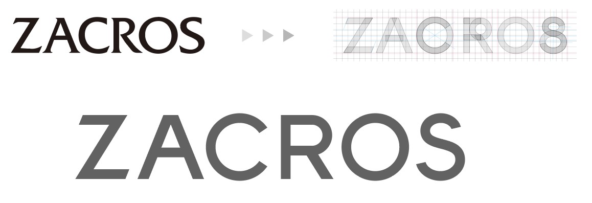
Our New Logo: Evolution Meets Inheritance
The essence of ZACROS’s new logo lies in two fundamental concepts: continuity and evolution. Our approach focused on refining our established visual identity while preserving its core character. This delicate balance ensures that our inheritance remains intact as we step into the future. By refining our design to be both simple and powerful, with forms and colors that convey softness and warmth, we aimed to create a logo that resonates across all countries and regions.
Our Legacy Logo: A Three-Decade Journey (1994-2024)
Created in 1994 alongside our brand name “ZACROS,” our logo was designed with our core technology of “layers of films” as its motif. The brand colors—blue representing the sky and green symbolizing the terra verde—expressed our commitment to harmony between people, society, and the Earth, embodying our vision for a sustainable future.

Harmonizing Innovation and Tradition
Our iconic symbol mark has evolved through careful refinement. We have sharpened the corners to accentuate the concept of the “Uncharted Forefront.” At the same time, we’ve softened and smoothed the two wave lines, extending them both upwards and downwards. This new design element represents the “Embracing Spirit” that we champion in our ZACROS VISION. This duality represents our commitment to advancing technology while maintaining our caring, inclusive approach to business relationships.

Our Global Logotype
Our new logotype features a minimalist, proprietary typeface designed with clarity and consistency in mind. By removing decorative elements while preserving the essential character of our previous design, we’ve created a versatile identity that maintains its integrity across all applications worldwide.
This refined design reflects both our 110-year inheritance and our forward-looking perspective. The logotype works in harmony with our symbol mark, their combined elements creating a distinctive and dynamic visual presence that speaks to our global audience.

Color Evolution
Our refreshed color palette maintains the environmental symbolism of our inheritance:
- The blue evokes the expansive sky
- The green represents the terra verde
- The refined gray logotype radiates vitality and optimism
Each color has been carefully adjusted to convey warmth and our “Embracing Spirit”, while maintaining our environmental commitment.
The Story Behind Our New Logo
The short movie shows how we created our new logo.

